Yesterday I was struggling with a design. It should have worked – I had gorgeous
shimmering white crystals, sparkling light blue ones, lovely frosted white
beads, a soft pale yellow – well you get the idea – all pastel colors. I had an original design I had sketched out,
my loom strung, and I started weaving.
Anyway, I worked the
pattern for a while . . . undid it . . . re-designed . . . wove again . .
.undid it . . . changed colors . . . .
The design was good – the colors so soft and cool – just right for
spring, but the magic was just not happening!
Frustrated, I sat back and looked around my design space and
out the window at my garden. What met my
eyes was strong color – everything, from the bright sunlit sky to the grass was
saturated in color. That’s the world I
have created. There are some pastels,
but they are foils for the rich deep colors I seem to thrive on.
Lesson learned - you will find bright, bold, deep,
rich, saturated color in my designs, with some pastels and pearls for
accents. Bottom line – Shakespeare was right – “to thine own self be true.”
Bold blue and sunflower yellow add a punch of color to the soft pearls
Deep forest green malachite is paired with rich dark red garnets in a rustic design
Antique copper and red coral pair for distinctive, eye catching earrings
Soft peach and pale pastel blue are great - when edgy black is added
Rich sunflower yellow citrine - brilliant saturated color
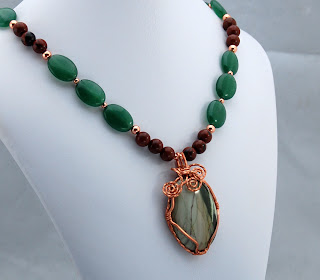
Bold green jade, black and brown mahogany obsidian and copper wire wrapped green jasper - rich deep color
Classic red and cobalt blue - lapis lazuli and carnelian with copper accents - deep color saturated gemstones
More cobalt blue lapis lazuli, this time paired with brilliant turquoise and copper. The rich colors make the beautiful white bird pop
Pink??? Sure - so long as it is a brilliant shocking pink, paired with dark green in these tourmaline earrings.
.jpg)


